
Two tone kitchen cabinets look intentional when the color change follows a line the kitchen already has, such as the base-to-upper break or the edge of the island, and when the two colors sit clearly apart in lightness. In the 2026 Houzz Kitchen Trends Study, 24 percent of renovating homeowners chose different colors for upper and lower cabinets, so the look is common. The ones that read as accidents usually split in the wrong place or pick two colors that are almost, but not quite, the same.
This guide gives you the split rules, a way to test contrast with a number instead of a hunch, and the ordering limits that decide which combinations you can buy. The facts about Hayden Island Cabinets, the manufacturer our studio is an authorized dealer for, come from the manufacturer’s own finish pages as they stood in October 2026. If you are still choosing a style, our look at kitchen cabinet trends covers colors and finishes more broadly.
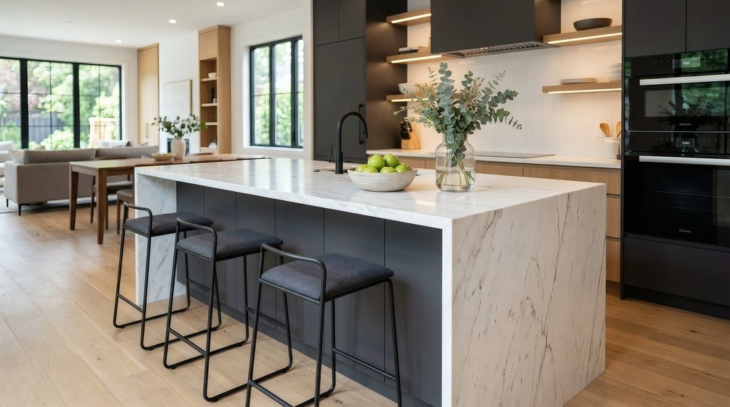
Split at a line the kitchen already has
A cabinet color change needs a reason the eye can see. Designers call these reasons break lines, and a kitchen has only a few good ones. The table lists the three most common, with what each does and where it goes wrong.
Three natural places for a color break
| Where the color changes | What it does | Watch for |
|---|---|---|
| Base cabinets versus uppers | Grounds the room with a darker lower run and lifts the walls | Dark lowers in a narrow galley can feel tight |
| Island versus perimeter | Makes the island a focal point | Two competing colors if the island is also large |
| Tall wall versus the rest | Sets the pantry or refrigerator wall apart | Looks random if the tall run is not visually separate |
The most popular upper-and-lower combination
The most popular split by far is light uppers over darker lowers. In the Houzz study, among homeowners who chose different upper and lower colors, white uppers led at 40 percent, off-white uppers came next at 19 percent, and wood tones made up 17 percent. Houzz surveyed 1,780 of its users in July 2025, so treat those figures as a read on design-minded renovators, not on every household.
What dark lowers and light uppers do
Hayden Island’s two-tone page says the same thing in plain terms. Dark shades on the lower cabinets ground the space, and light uppers make the kitchen feel more open.
Where to end a color change
Never split in the middle of a run. A color change halfway along a row of base cabinets looks like a mismatched replacement, not a decision. End the change at a corner, at an appliance, or at the end of the island, where the cabinet itself stops. If you are weighing where an island sits in the first place, our piece on statement kitchen islands covers the style side, and our kitchen layout mistakes article flags the traffic problems an island can create.
Choosing two colors that sit far enough apart
A pair of colors reads as a deliberate contrast or as a near match. The risky zone is the middle, where the two cabinet colors differ slightly, enough to look like one batch of paint aged unevenly. You can test this with a number.
Use LRV to compare paint colors
Paint makers print a light reflectance value, or LRV, on every color chip. Sherwin-Williams explains that the scale runs from 0, which absorbs all light, to 100, which reflects all light. A design blog that lists Sherwin-Williams values gives Pure White at 84, Agreeable Gray at 60 and Dovetail at 26. A cabinet pair of Pure White and Dovetail sits 58 points apart, which reads as a clear choice from across the room. Two colors that sit only a few points apart read as one color that aged unevenly.
A practical LRV contrast range
This guide’s working rule, offered as this guide’s judgment and not a code or a published standard, is to keep the gap under about 10 points or over about 30. Under 10, the two cabinets read as the same color in different light. Over 30, the contrast is unmistakable. The same source notes that a color only reflects the light it receives, so a kitchen with little daylight will make the darker color look darker still. Always check the pair in your own room, at the hour you cook.
Use the 60-30-10 rule across the room
Wren Kitchens, a UK kitchen maker, quotes the 60-30-10 rule for a whole room: 60 percent of the room in a dominant color, 30 percent in a secondary shade, and 10 percent as an accent. In a kitchen, the dominant color usually lands on walls and one cabinet group, the second on the other cabinet group, and the accent on hardware or a backsplash. Treat it as a way to keep yourself from adding a third cabinet color.
For a gentler look, our guide to warm versus sleek kitchen aesthetics helps you decide whether the pair should lean warm or cool before you pick chips.
Pairing paint with wood stain
Painted cabinets paired with natural wood
The pairing Hayden Island’s page calls out is painted cabinets with natural wood. The Houzz study backs up the appeal of wood: it was the most popular cabinet color overall at 29 percent, ahead of white at 28 percent. A stained wood island against painted perimeter cabinets gives you the two-tone look with the most warmth.
Why wood stain looks different by species
The catch is that stain behaves differently on every wood. Hayden Island’s finishes page says so directly: because of differences in the same stain on different woods, and because monitors misrepresent color, its online samples give only a general idea, and you should see real samples at a dealer showroom. Its own sample photos are all shown on alder. A walnut stain on maple or on cherry will not match the picture on the screen.
How painted and stained finishes differ
That affects a two-tone plan in a specific way. If the island is stained and the perimeter is painted, the two surfaces are different materials as well as different colors. Painted doors are often made from MDF because it paints smoothly, and plywood is commonly used for the boxes, according to Hayden Island’s materials guide. A solid wood stained door has a visible grain pattern that a painted door does not. So the island will always look more textured than the perimeter, and you should decide whether you want that.
Repeat wood tones through the kitchen
Keep wood tone to one species and one stain in the whole kitchen. If the island is a warm honey tone, a wood range hood, floating shelf and stool seats should echo the same family, or they will look like leftover pieces. Our overview of kitchen remodel materials compares wood, laminate and other cabinet-adjacent surfaces if you are still deciding.
Cabinet line and door style limits
This is the part most two-tone articles skip, and it is where plans fall apart. A combination that works on a mood board may not exist in the line you can afford.
Finish options in the Cornerstone line
Hayden Island describes its Cornerstone line as a Shoreline line trimmed down to compete with production cabinets, and it is frameless. The finishes page lists what the line leaves out. Only four paints are offered: white, linen, vanilla and graphite. Six stains, including Cabernet, Fireside Red and Toffee, are unavailable. Only the black and brown glazes are offered, and distressing is not offered at all. Shoreline, the fuller frameless line, offers glazes, sheens and distressing.
The practical result is a short palette in the budget line. A graphite island with white perimeter cabinets works in Cornerstone, but a green island from the paint list does not appear in it. A stained walnut island with painted white cabinets is possible, and a cabinet in Hayden Island’s red stains is not. Ask your dealer which line a design needs before you fall for a color.
Choose a consistent door style
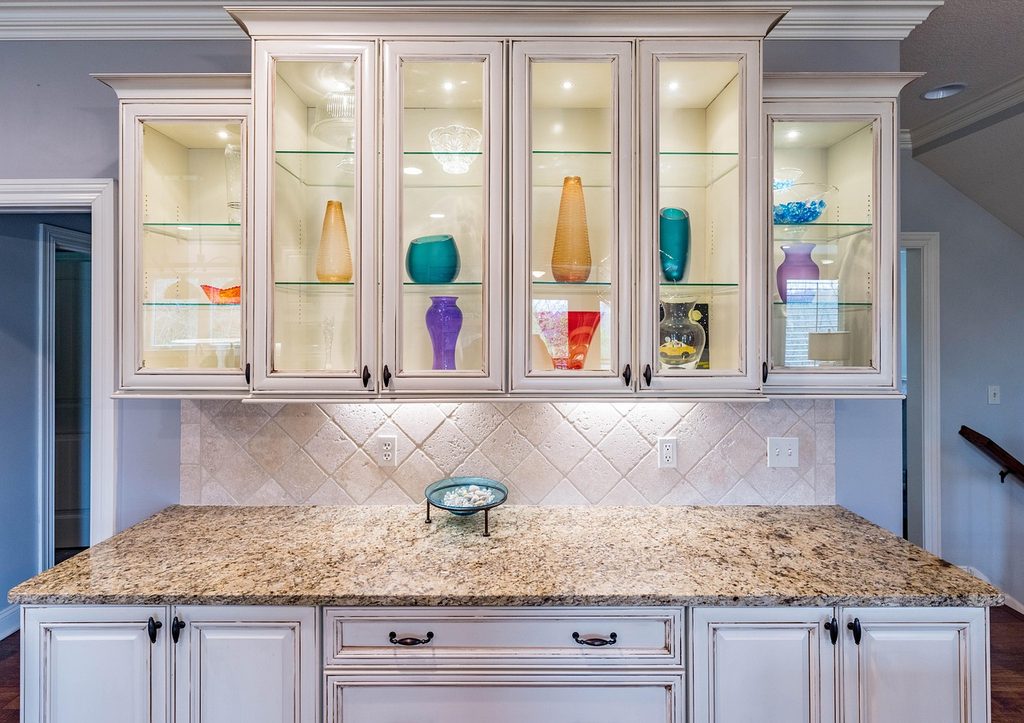
Door style also restricts the choice. Hayden Island’s door styles page labels Marlowe and Franciscan as painted only, while Columbia is listed as solid wood. If you want a stained island, you cannot use a painted-only door on it, and a matching door style across both colors keeps the two-tone from turning into a style clash. Using one door style in two finishes is the safest route, because the shadow lines and profiles stay identical and only the color changes.
How inset doors affect the look
Hayden Island’s Hayden Bay lines, which have framed inset or overlay doors, add a further choice. Inset doors sit inside the face frame, which gives you a visible frame line around every door. That line makes two-tone look more architectural and can also make a color change feel busy, so it pairs best with one calm neutral and one quiet accent.
Tying the two tones together
Two colors need a third element that appears on both sides of the break. Hayden Island’s guidance is to use the same fittings or countertop across the contrasting cabinets, and that advice holds up. A single hardware finish, such as aged brass on every pull, makes a dark island and a pale perimeter read as one composition.
Use a countertop to connect both colors
A countertop that runs from the perimeter across to the island does the same job. If you are still choosing slabs, our countertop materials guide lays out the options, and a veined top that contains both cabinet colors is the easiest one to match.
Keep the sheen consistent
Sheen matters more than most plans admit. Hayden Island notes that matte finishes read as contemporary while glossy ones reflect light and look sleek. Mixing a glossy island with matte perimeter doors makes the two cabinet groups look like they came from different manufacturers. Order both colors in the same sheen unless you have a strong reason not to.
Plan lighting for darker cabinets
Lighting changes how both colors read after dark. A dark lower cabinet absorbs light, so pendant and under-cabinet lighting help the lower run keep its shape. Our guide to layered kitchen lighting walks through ambient, task and accent layers, which matters more in a two-tone kitchen because the dark half hides detail.
The case for one color
When one cabinet color may work better
A second cabinet color is not always the right call. In an open-concept kitchen where cabinets are visible from the living room, two colors can compete with the furniture, and one calm color is easier to live with. Our notes on open-concept kitchen ideas cover how a kitchen reads from the next room.
Two-tone choices for small kitchens
Caution applies to small kitchens too. Every color break adds a visual edge, and a small room has little space to absorb them. If the room is tight, a single cabinet color with a contrasting counter often looks calmer than two cabinet colors. A minimalist plan, like the ones in our minimalist kitchen design article, tends to lean on one cabinet color for exactly this reason.
Ask what the second finish adds to the price
The other reason is budget limits. This guide found no published price premium for a second cabinet color, and Hayden Island’s own cost page lists no dollar figures, so the honest answer is that it depends on the line and the dealer. Ask for the quote with both finishes priced separately, so you can see what the second color adds before you commit. Our remodel budget guide shows where cabinets sit in the larger budget, and a designer on your side can run both versions for you, as explained in the benefits of working with a kitchen and bath designer.
FAQ
Best cabinets to paint darker
Paint the base cabinets or the island darker, and keep the uppers light. Hayden Island’s guidance is that dark lowers ground the space and light uppers open it up. Choose the island first if you want a single bold move.
Number of colors in one kitchen
Two cabinet colors is the practical limit. The 60-30-10 rule leaves room for an accent, but put that accent in hardware, tile or a stool, not in a third cabinet finish. A third color on cabinets is what makes a kitchen look undecided and cluttered.
Samples before you order
Always see a physical sample of each color in your own kitchen. Hayden Island says its online swatches are a general guide only, since the same stain looks different on different woods and screens distort color. Look at the sample in morning and evening light.
Next step: a short conversation
If you are weighing two colors and one line, book a free discovery call. It is an honest conversation about your home, with no sales pitch and no obligation, and we can look at your layout together. Ask for our free “Planning your remodel budget” guide at the same time. Start with a short call on the contact page, or read about our studio first. You can also see the full path from first sketch to final walkthrough on our process page.